
You know when you notice something and then suddenly can’t un-see it, and you’ll not rest until you’ve got the answer as to exactly what it was that you thought you saw? No? I have, and it happened when I was sitting at the wheel of a Volvo S60.
I’ve driven most of the current cluster of Gothenburg’s ice-cool, chisel-jawed current-day exports, and generally see them as being poles apart (or even Polestars apart) in so many ways from their boxy-but-good predecessors. They exude moneyed sophistication from every pore, without channeling the brash one-upmanship that’s shouted from the angry grilles of every Audi or BMW. At the same time, though, they seem to be almost palpably brushing aside the austere sensibleness that came to define the brand for so many decades.
From behind the wheel, all is digital and precise, with screens that bristle with all the information that you could possibly need while driving, as well as quite a lot that ought really not to be of concern. The centre console is dominated by a portrait-oriented screen that looks terrific, but when navigating through its various command levels, it always feels like contrary steps are knitted into the process just to keep you on your toes. It’s as if the design experts had a meeting and concluded that “people no longer want to be able to operate controls while wearing thick gloves”, a benefit that had been baked into the Volvos I spent time in as a kid.
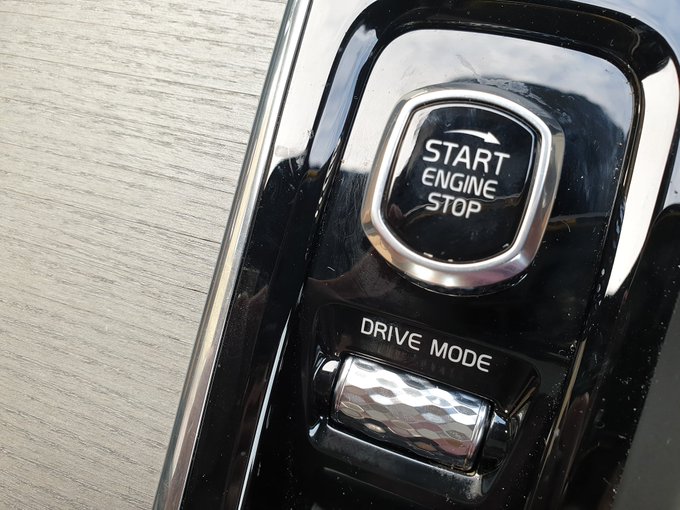
It made me feel a bit glum to consider that the baby had evidently gone down the same plughole as Volvo’s bathwater when suddenly there shone a twinkling light in the dismal gloom of inevitable “progress”. I spotted that the inscription “ENGINE START STOP” on the top of the slightly daft twist-switch that does just as the label denotes, was written in the same familiar typeface as I remember being surrounded by in Volvos of my youth. As is my won’t these days, I immediately snapped a picture and broadcasted my joy on Twitter.
Among the responses, a chap asked if the font had a name, or if it was Volvo’s own. What an interesting question, I thought, and immediately set about finding out. At that point, it was 23:00 on Friday night, so I had no real intention of diving deep into internet rabbit holes of typographical history, but Googling a few choice word combinations pointed me in the right direction. By 23:17 I was able to Tweet my answer, and such did I regard the very gravity of what I had found that I afforded it an entire Tweet all of its own.

My search results had brought me to a Wikipedia entry for a font called Handel Gothic. Under the sub-heading of Corporate Uses, it served this nugget: “Volvo – has used the font since 1974. Initially, it was used for the model badges on its cars, but this application ceased in the early 1980s when it began to be used for the instrument panel and dashboard graphics, where it has been applied ever since“.
It had never occurred to me that Volvo might have just dipped into “the big book of fonts” when choosing a typeface for their dashboard markings, but, of course, that’s just the kind of thing that happens every day in boardrooms around the world. It just happens that Volvo’s choice had stuck for quite a long time. I tested the voracity of Wiki’s claims, and various Volvo owner’s fora echoed similar sentiments, as did a number of websites and publications devoted to typography and graphic design.
Hungry with curiosity, I read more from that list of corporate uses to see where else Handel Graphic might be seen, and was startled by just how many unlikely-seeming places it had appeared. Here are a few notables:
“It was a popular font in the 1980s due to its futuristic design, and even today is used to signify the future; it has been used in the credits of both Star Trek: Voyager and Star Trek: Deep Space Nine as well as the logo for Close Encounters of the Third Kind.” I love the idea that, in 1974, a range of cars that really were among the least progressive or forward-thinking in the world, adopting a font that would come to be associated with science fiction.
“The Walt Disney Company used Handel Gothic in the logo of The Disney Channel from 1983 to 1986. The font was also used on the Walt Disney Home Video logo Neon Mickey from 1983 to 1986. Additionally it was featured on the 1971 to 1996 Walt Disney World logo with a Mickey silhouette within an oversized “D”, as well as on signage within EPCOT Center prior to refurbishments” Of course! I remember the sign for Spaceship Earth and sundry other Epcot attractions, and thinking them kind of neat, but never linking it with square-rigged Swedish cars.
So invested was I in the information I had discovered, that I addressed Richard Porter of Top Gear UK scriptwriting fame in the tweet. He’s been assembling a book of car trivia and recently invited folk to share their tedious facts. This could be mine. He replied, too, if only to throw a few buckets of piss on my bonfire.

“I’m not sure this is correct” he said, and quite rightly pointed out that Volvo has its own font called Volvo Broad, which, as soon as you see it, is instantly familiar from promotional hoardings and advertising releases over the last few decades. It’s true. But it’s very different to the font that appears on this Volvo S60’s engine start knob, on the Volvo 760’s instrument cluster, the S40’s centre console controls seen below and other places too numerous to mention.

Other respondents pointed out, too, that there are clear differences between certain characters in the Handel Gothic alphabet and those that appear in a typical Volvo. The horizontal bar in upper case G, for instance, is a lot shorter in the car. Others, though, pointed out that typefaces themselves can end up being modified over the years. It could well be that the unmodified G was tried, but it was decided that a few visual tweaks were needed.
And that’s pretty much that. I’m pretty sure that Volvo’s long-serving font of choice in the years before its cars went all space-age and fly-by-wire, was Handel Gothic. And I’m also pretty sure that I’m going to keep spotting examples of typefaces in cars that I just swear that I’ve seen somewhere else, and later finding my suspicions realised.
Ah, corporate usage of fonts! Most car manufacturers have an owned font, and if it is just a minimal retouch of a foundry’s catalogue font. Probably for narcissistic reasons, or in this case, because this is more legible in northern lights or something.
Some are more characteristic, such as this one or the two Porsche fonts (the sci-fi one and the model name curly one, they probably have a blank one for the brochures). Those are owned to prevent plagiarism or pranks I guess.
I am working with an electronics corporation where everything is Arial, for compatibility reasons (laziness and money), sigh. Even MS is trying to make up for that font, everybody could download Georgia and Tahoma for years now, or even Bahnschrift.
My latest book I bought on fonts is “Typeset in the future”, where they analyze fonts in sci-fi movies… Wall-E and Blade Runner, for example.
When you tweeted this, I went looking for a Volvo with some sort of Close (Encounters) button instead of seeing this much more obvious option
https://uploads.disquscdn.com/images/e10632cdc06307c5a9c739300dc6a0a5b47b2358505c876cd3c8b977a4cd36b0.jpg
LOVE that.
I’ve always been intrigued at the use of separate fonts on a given car vs its marketing materials. it makes sense, of course – inside the car you need legibility, in the marketing you need to project an image – but both of them form identities for the manufacturer, and as evidenced by this article, we appreciate them as consumers. I’m sure most of us here could easily recognize the fonts used in Mercedes, BMW, and Volvo ads in particular at a glance.
*ads and dashboards.
Volkswagen went now consciously to one set of fonts for print and car and web at the rebranding, partly motivated by the fact that you have bunches of text on the screens in-car. Used to be some Futura/Utopia cuts, which conveyed a Bauhaus-y sobriety.
I haven’t looked at the new fonts closely yet.
Changing these things consequently will take years, though.
their dashboard font was great! I hope they don’t fuck it up
Truly epic level (depth?) of trivia!
Talking of Handel Gothic and car culture, you’ll notice it cameos in the credits for Knight Rider, most prominently in the ‘EXECUTIVE PRODUCER GLEN A LARSON’ line.