![]()
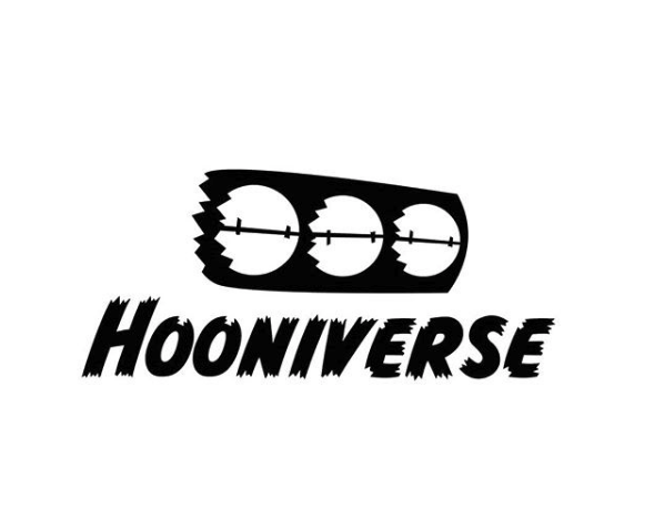
We’re in the midst of a redesign. Our site needs some love on the back and front end (doesn’t everyone, really?), and the time has come to make that happen. Above, that’s a glimpse of one of our new logos. We’re still dabbling with colors and the layout of the new site is being refined as we speak.
If you were tasked with this overhaul, how would you handle it? What would you want done on Hooniverse 2.0? No, the content (we hope) you enjoy isn’t changing. Just the look and feel of place where it all lives.
Sound off below and let us know your thoughts on a Hooniverse redesign.
Hooniverse Asks: If you were to redesign Hooniverse, how would you do it?
About
45 responses to “Hooniverse Asks: If you were to redesign Hooniverse, how would you do it?”
-
But…what is your core vision, your organisational ambition, and how can the Hooniversal HQ pool be even more bubbly than ever before? That’s the sort of questions people around here would have to answer while building marshmallow-and-spaghetti-towers and getting drunk in mostly uneasy settings.
Would this be a moment to share some traffic data and info on how and where people come here? Seems like the amount of posts have gone down a little, while there’s a pretty stable crowd. Facebook, too, has become an area separate from the blog?
Personally, I’ve always liked the existing logo, but I might be partial with what graces my home office window:
https://i.imgur.com/UOF9zWcl.jpg
Simplifying that logo a little and cleaning up the somewhat cluttery front page should do a big deal to modernizing the site.-
Trabant Logo on glacial slate for the win !
-
That view makes me feel some serious jealousy.
-
I wouldn’t get much done with a view like that out my office window.
-
I’m not pretending I do either. Scraping by though.
More on-topic, trying to think of new logo variations, all my ideas are quite cheesy. But the above “hairy font with blower” seems like a done deal anyway?
-
-
-
Your description of team building activities is eerily accurate, all that’s lacking is a bit more buzzword bingo (and also, “X is a drug free working place. Go drink outside, but remove your corporate badges first.”).
-
-
I like the existing logo, and the font above is OK, I guess. But what is that logo supposed to be? The Pac Men Ghosts running into barbed wire?
-
My first thought was “heavily customized STADCO Life Saver” but maybe that’s just me.
-
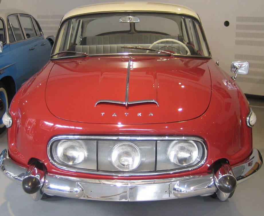
I saw the front end of a Tatra, but maybe that’s just me. https://uploads.disquscdn.com/images/b294e712c0a880a8a8a28d7f8e1ea3ba33410b1e7e3b88333fe7ca1bd0ed1154.jpg
-
-
I wondered that myself. My best guess was a blower with open butterflies.
-
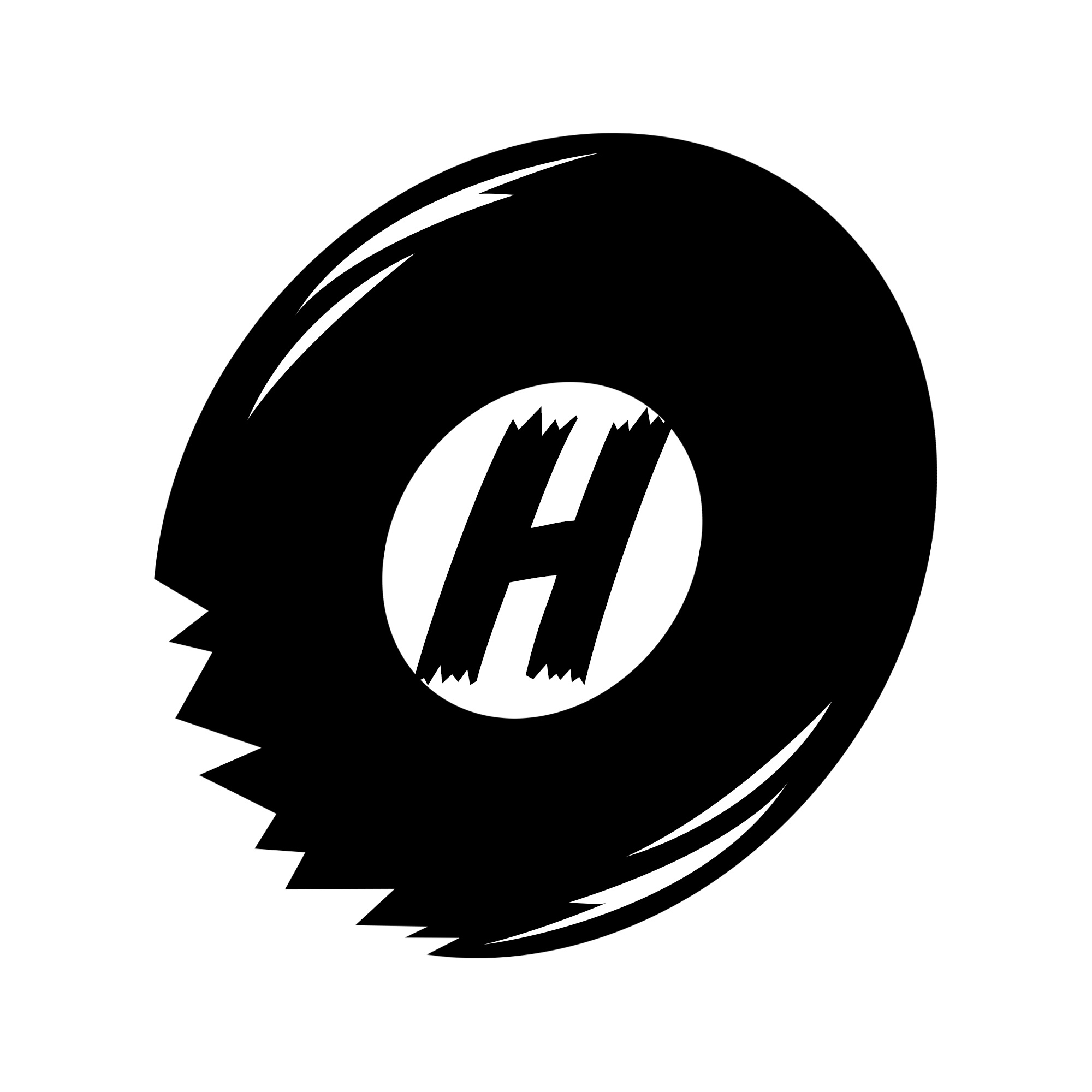
It is indeed a stylized blower
https://uploads.disquscdn.com/images/5f7129fc760599140657ec8f9436c62f79d7e10585964dc586514e6f9e01a366.png
Here in cleaner black and white.-
If you have to explain it to a bunch of car nerds, it is too stylized.
-
I’ve shared it with other car nerds ands they got it right away.
This is another logo we’re incorporating…
https://uploads.disquscdn.com/images/c2fc532247e3d64e17245f51672081539b48df4ef71e8b6f2c163b225217609e.jpg -
Shattered Magic 8-Ball trying desperately, but futilely, to spell “HELP!” as its precious bodily fluids quickly drain away?
-
8 ball was my first thought.
-
Or a modded robot vacuum cleaner careening around the family room.
-
-
-
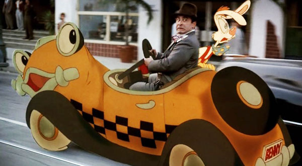
Benny the Cab switched to blackwalls and had a blowout?
http://artfcity.com/wp-content/uploads/2015/07/yellow-cab-roger-rabbit.jpg
-
-
-
Backwards pac men ?
-
I just see three Paranoid Android heads.
https://cdn.shopify.com/s/files/1/2224/6235/products/Prod_Marvin_Sad_8x10_1024x1024@2x.jpg?v=1512484225
Nah, it’s a traffic light that’s been savagely knocked to the ground & caught fire.
I hesitate to say anything but it may, just may, be time to give up on the forum. The last post was back in February of 2016.
-
The forum is essentially dead, but we’ve left it up in case anyone was still playing in that sandbox.
-
As a geologist I’m all about playing in sand and taking a laissez-faire approach to the passage of time, but I’m also trained in recognizing dead things, particularly after they’ve been dead a while. I think it’s very likely more than just “essentially dead” at this point.
-
Speaking of the past , I was looking through the Atomic Toasters archives and found a couple good articles I had not seen.
-
-
+1 vote for keeping the existing chrome logo.
-
I love that logo, but that’s going away. Maybe we can find a space for it on the new site.
If I were to redesign Hooniverse, I would add more black and hookers.
And pictures of Simcas.
Not a fan of the new logo, but subjective is kinda what your asking for, objectively, I think the “shattered” text is kind of hokey.
I like silhouette shots of vehicles, so that’s where I’d be heading.
I also do not like the right hand side bar, just seems like an afterthought.
I have seen other blog sites that have top comments there, to pull you into discussions, because we all know that’s where real stories are.
One bugaboo I have with a lot of discus powered sites is you have to make the jump to read comments, it may be a platform limitation, but my vote would be to click into comments and have them.
-
Sidebar is going away.
Logo should stay chrome. Overall look should continue being easy to read. However, when it comes to content, I’d like to see more old cars and even less new. Show us more of the work it takes to keep real hoon vehicles on the road. Hooniverse is pretty good, but it’s wandering a little.
-
Right now on the homepage, out of ten posts just two are about new cars. I know what you’re saying, but the site has always flowed between new and old – We’re fans of both.
The new look is going to be far easier to read (I have access to the beginning stages of the new site), and the text and headline font is great.
If we’re creating a new version of the site, we can’t stick with old logos.-
I agree that the site could use some freshening, but a good logo becomes iconic with time, even if it evolves. Mercedes’ three-pointed star, Porsche’s crest, Volvo’s iron symbol, Ford’s blue oval, BMW’s roundel, and many others are good examples that suggest stability and longevity. I think the existing Hooniverse logo is similarly timeless and stylish. Even paired with the spinning wheel in the site’s videos– very tasteful.
It’s obviously not my site, and I come for the content, not the looks. No offense to the designer, but the new logo is more what I would expect on the package of a really sour candy or a sign for one those temporary seasonal Halloween stores. It’s just trying way too hard.
Could you guys at least do just one more run of the old logo stickers?-
I have a number of the simple HOONIVERSE text stickers on my desk, and we can always make Hooniverse Classic stickers, haha
-
-
Some notes:
-We will find a way to incorporate the old chrome logo into the new site, but it won’t be the main logo anymore.
-The sidebar is going away, which we all agree is a good move.
-The readability of the new site is excellent. I think you’ll enjoy that bit.
-The content will continue in the same manner as it has, a mixture of old and new, with stories of our project cars along the way. Motorsport coverage when it makes sense. Two-wheel stuff on Tuesday when we find good posts. Etc.
Is the mobile site being revamped, too? Just curious.
But on a serious note, I think the text is a little too busy. Smoothing out the the ragged edges look far better, IMO.
Why not both? By which I mean curving the old chrome Hooniverse to make it a shift lever support for the new 8 Ball (with an H pattern) shift knob?
For some reason, I don’t get updates from this site for a few days and then there’s a barrage of post dated articles. I’m not sure if its something on my work computer or not.
Also can we bring back Craigslist crapshoot?
-
I have the same issue. Updating the site helps (refresh or F5).
-
Yep. Same here. First thing I do when I load the site is hit refresh.
-
It doesn’t always work for me.
-
User developed design always ends well
https://cdn-images-1.medium.com/max/1600/1*Y3ZibsBlrVfWspy9HLANPQ.jpeg
I picked up on stylized butterfly air scoop right away, for whatever that’s worth, but my personal hoonery began watching drag racing so it’s closer to home for me. People around here aren’t ashamed to admit that they like the aesthetics of Saab 900’s, so take our feedback for what its worth. If it’s more readable and functional with the same content, we’ll be fine.
How about bringing back any existing IntenseDebate comments on old posts? There are plenty of Hooniverse Asks…that are now unanswered, even though I shared my brilliance on the topic a half-decade ago.
I don’t get why the blower is all jagged. And the colors look very Halloween. If you’re going for a two-color logo, maybe you could make several in different color combinations for different holidays or seasons?
Also, the sidebar has links to forums and the store, the former of which hasn’t been used in years and the latter mostly out of stock. Maybe it’s best to narrow the page down to just the things y’all do best.
All in all, as long as the writing is the same, I’ll still be here. Just don’t remodel this place after Jalopnik, I came here from over there and I won’t go back.
Leave a Reply