
Sometime ago I wrote a quick article about the dashboard layout of the new/current Ford Expedition. Unfortunately that article is currently unavailable due to the site redesign [Editor’s Note: Post migration has begun but it’s a slow process]. But in it I complained how there were too many buttons on that dash. To make things worse, those buttons were all the same, arranged in identical rows. I mentioned how finding the desirable button required the driver to take his/her eyes off the road.
To be fair, many of those buttons on the Expedition were redundant. Most functions could be performed via the touch screen and Ford’s excellent MyFord Touch system. But it still made the dash possibly challenging or confusing to use for some people. It was a busy and inelegant design.
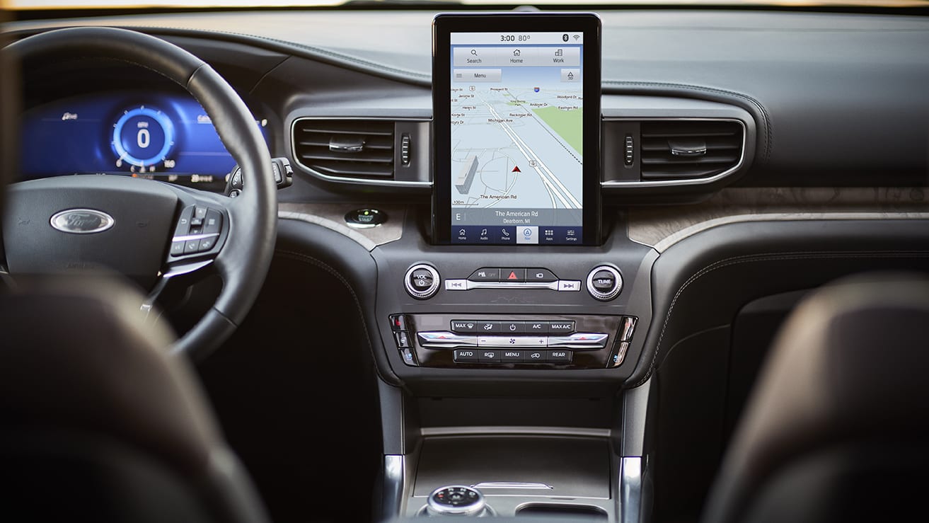
Ford designers must have that article of mine. Above pictured is the dash of the new 2020 Ford Explorer. And it’s clean and easy to use design. Buttons for HVAC controls and audio system are kept to a minimum. There are temperature toggle switches and knobs for the volume and tune controls. It’s really clean. If the new touchscreen interface is anything like the existing MyFord Touch system, then it will be one of the best in the business.
Good job, Ford designers. I have high hopes for this new Explorer. Below, for reference, is the Ford Expedition dash.

I just started warming up to electric windows. I’m not yet keen on touch screens in cars.
In all seriousness, I think touchscreens, with the requirement to locate and put your finger on a particular spot, take the driver’s eyes away from the road too often and for too long. Physical controls, which I can eventually learn through muscle memory, can eventually not even require my eyes at all. Where you touch on a screen changes depending on which menu you’re in, and there’s no tactile feedback so you must use your eyes, regardless how familiar you are with the layout. Granted, their versatility is revolutionary in replacing a multitude of buttons, but I think when the car is in drive, the screen should be locked into a static set of options. Scrolling through menus while driving is just as bad as texting.
100% agreed. Physical controls all day every day.
I think if it’s done right, there’s controls to handle your frequently adjusted functions (mostly volume/temperature/air speed and flow, as most do now), and voice control is a big help as well (when done right), but modern cars have too much adjustability to not use touchscreens.
That said, I don’t feel like I’m missing out, driving a 5 year old subcompact missing all that stuff.
I don’t think the touchscreen shouldn’t be there at all, I just think it shouldn’t be accessible while driving. All controls pertinent to quick use while driving should be physical, not digital.
My Austin Maestro has electric windows for its front doors but I’m not happy about it. At least it still has a manual choke, so not all is lost.
Interesting overlap of new and old, what year is the maestro from?
(I know power windows were around in the 50s, but they were not that common, at least outside the US for all I know)
Suggestion for hooniverse ask maybe? cars with the biggest “age” gap between items of equipment? (it needs many caveats)
** edit: I was thinking of the maestro as a 90s car, because here in Uruguay it was ( https://en.wikipedia.org/wiki/Austin_Maestro#Decline_and_%22rebirth%22 ). But it seems it’s an 80s car, so maybe a manual choke was not that out of place? maybe?
Mine is from 1983. It also has a talking digital dash, which is an even greater incongruency in juxtaposition to its choke knob.
My ’82 Allegro also has a manual choke, so at least in the UK this feature was not out of place in the early ’80s.
For reference: my 1964 Chevy Corvair (which was essentially an econobox) has an automatic choke… But manual windows and manual convertible top.
nice! convertible corvairs are great
I know that on my car (2018 Mazda 3) that the touch screen is disabled while the car in motion. You can still control things using the big knob while on the move though.
I have to say I prefer the layout, but not the design or materials, of the older one. Some of the ‘buttons’ on the new explorer look like they might just be capacitve like on some cadillacs. I’d prefer a knob over a rocker for changing the temperature. As for changing where it blows, the old version was one button press for the desired change, where the new one I assume you cycle through the options. I wonder if lower trims will still get the giant ipad stuck to the dash, and how bright it is when driving at night.
This guy is nuts, and is just swooning Ford. This is the most hideous and lazy dash I have EVER seen.
Agreed, this guy is nuts. No way in hell are the controls pictured at top easier, quicker, or safer to use than those pictured at the bottom. This boils down to:
– Touch screens actually are cheaper than buttons and knobs.
– Most car buyers are uninformed.
– Many car buyers also are screen addicts, and they value a big screen even if it’s less fit for purpose than physical controls.
– Most auto scribes, who should be well informed, aren’t. They’re (at best) half-smart, half-informed content farmers, and they may or may not be getting kickbacks from the manufactures. This guy seems to be a case in point.