
Welcome to “Thread The Needle!” A weekly column that explores the rich history of motorsports by way of the thrift store t-shirt.
Oh yeah, now we’re getting to the good stuff. The European stuff. No more sweating in line for a beer at Indianapolis or praying to your higher power that the Port-A-Potties at Knoxville haven’t become a vector for some new species of ringworm. No sir, we’ve gone positively continental: fine art, crippling taxes, and MotoGP.
Motorcycle road racing has a certain universal appeal. Show a layperson hour seven of a 24-hour endurance race and they are likely to ask why everyone is being so polite. Flip channels to a MotoGP race and they will be with it out of the gate. Its combination of close racing, obvious speed, and visible drivers make it an enjoyable spectacle regardless of your intellectual involvement. What we know now as MotoGP started in 1949, when the Fédération Internationale de Motocyclisme organized the first season of multi-class, multi-discipline motorcycle racing. Since then, the premiere class has endured numerous name, displacement, and dominant combustion cycle changes while enjoying surging popularity.

The seller of today’s example erroneously claims this relic hails from the 1980’s. Even if you aren’t familiar with the legendary Kevin Schwantz, a few minutes with Google and you’d know this shirt couldn’t possibly be from a year prior to 1990. Schwantz was a Pepsi man during the ’88 and ’89 seasons, kicking the cola habit for Lucky Strike in 1990. Fine by me, because those company colors make for a much better composition when juxtaposed to Belgium’s national scheme. And quite the composition it is. It’s busy in a very different way then some of the other shirts we’ve looked at. The subject itself (Schwantz mid-turn) is nice enough to look at, but it is not what excites me about the design. I feel that its most attractive element is the variety in typographic styles. Despite featuring a whopping four fonts, the shirt maintains an oblique perfection. It is far from symmetrical, but still balanced. The success of this design is not unlike the riders themselves, who defy logic as they maintain control while leaning off their bikes at incredible speed, and the variety of font mirrors the array of sponsorship logos the racers don.
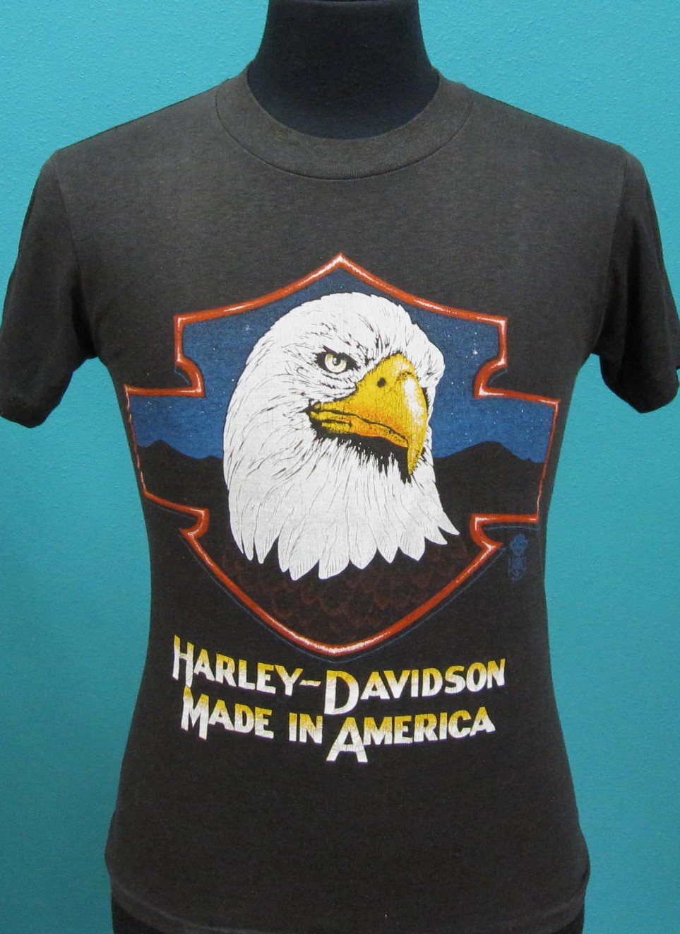
There is something else that I find amazing about this shirt. Typically I am strongly opposed to any display of nationalism on an article of clothing. Say what you will, but personally I find donning the American, British, or Canadian colors a bit, well…distasteful. This piece doesn’t elicit the same reaction from me. Perhaps it’s that I am emotionally distant from the Belgian national identity, or perhaps it’s because of Western Europe’s rich tradition of Constructivist and graphic poster art. Either way, I don’t feel any history when I look at this piece like I might if I stared at a Harley-Davidson shirt or Norman Rockwell painting. Some critics would say that is very problematic for reasons too complex to get into here, and I would agree. But just like the layperson watching a MotoGP race in amazement without any understanding of the sport, sometimes it’s ok to just appreciate something the way you see it, and sort out the details later.
Special thanks to Etsy user LEATHERBENT for the images. Sorry, you can’t buy this shirt because I did.
Leave a Reply