On Unexpected Artistry

IMAG5196
Very occasionally I will find myself bored while in the car and parked, waiting for somebody. If I’m beyond the reach of internet data I will often rummage around the car in search of something to read; the “EXT, ECON, MIRROR, OFF and CD CHANGER CONTROLLER” printed on the dashboard in front of me being of insufficient literary merit to keep me entertained for long.
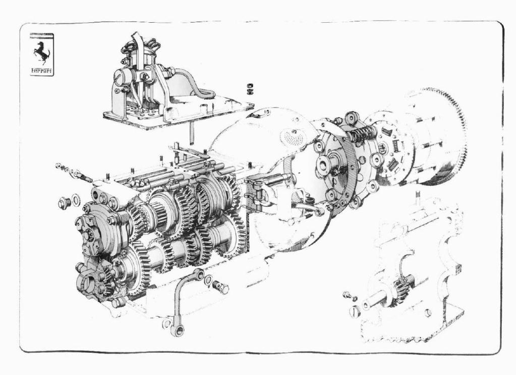
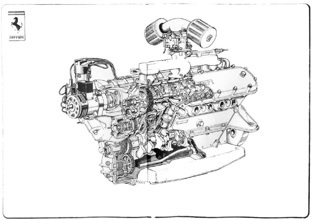
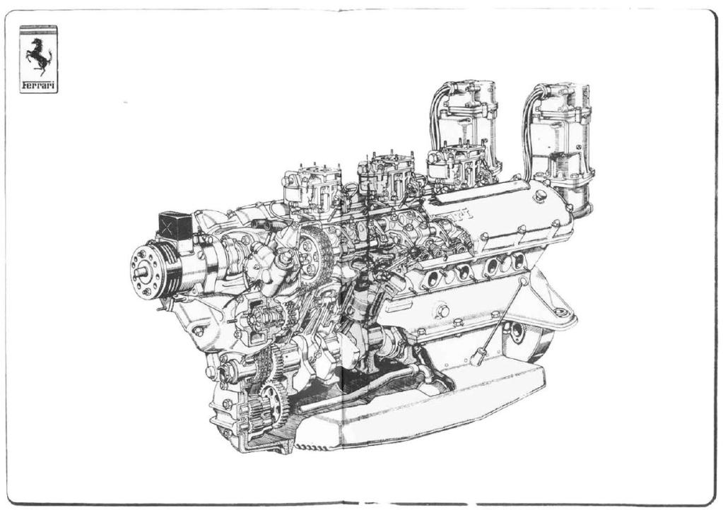
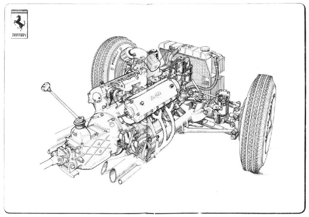
So I turn to the owners manual. Often I’ll peruse these documents and marvel at the additional features that are described in the book but are nowhere to be seen in my car. Ah, the joys of mid-range specification. But in manual for my Rover I am kept more amused by the exquisite watercolour sketches that announce every section of the instructions.
It made me wonder if this was a Rover-only phenomenon, or is there more unexpected artistry out there in vehicle owners manuals than I was ever aware of?

IMAG5197

When raising your car
Be certain to place the jack
On even terrain.

Perhaps there are cars out there, Japanese, perhaps, whose instructions are written in Haiku?

To set cruise control
Maintain the speed you desire
And press button 2

If seats become marked
Clean with soap and warm water
Not harsh chemicals

If your owners manual is a greater work of art than mine, let us know in the comments.
(Images copyright Chris Haining / Hooniverse 2016)

Leave a Reply

Your email address will not be published. Required fields are marked *

The maximum upload file size: 64 MB. You can upload: image, audio, video. Links to YouTube, Facebook, Twitter and other services inserted in the comment text will be automatically embedded. Drop files here

  1. Borkwagen Avatar
    Borkwagen

    My Jag’s instruction manual also has these delightful watercolors. Meanwhile, my Saab’s manual contains pictures of an anonymous man in a pinstriped suit.
    http://pic.armedcats.net/l/la/labcoatguy/2013/01/29/saab_manual.jpg

  2. nanoop Avatar
    nanoop

    Thanks to the standardisation of tools, technical documentation is forced to lose individuality. Illustrator drawings are easier to maintain than photos, let alone hand drawings. The current ideal in the industry seems to be Ikea assembly instructions. Text must be generic for reuse, and ideally, easy to translate by software.
    The time between final design and publishing of user documentation is about identical, so there is no margin for creative last minute changes, that’s eaten by design changes. Writer teams are small and distributed across the globe, not a couple of lads going for a pint together every Friday.
    The 944 handbook, 1983, has a very sober, precise tone that tells me what to do – The Focus sports color key drawings and tells me what not to do. The length of sentences differs (both in German), and also the feeling of being in both charge and control is not very strong with the Focus manual.
    That’s a pity, but the modern times only make me marvel at the old masterpieces. I miss the regular pint, though.

  3. Sjalabais Avatar
    Sjalabais

    My ’71 Volvo 145 had a great manual with lots of cartoonish drawings. It was surprisingly little PC when it came to gender…even though I was sure I had scanned all of that, I can’t find it now. Lots of computer changes and insufficient backups have made sure of that. It was all done in this style though:

  4. NapoleonSolo Avatar
    NapoleonSolo

    That style of art looks very much like that in Rover brochures from the 60’s I have for the P4 and P5.

  5. smokyburnout Avatar
    smokyburnout

    somewhat reminiscent of the manual for another fancy British car from the 90s