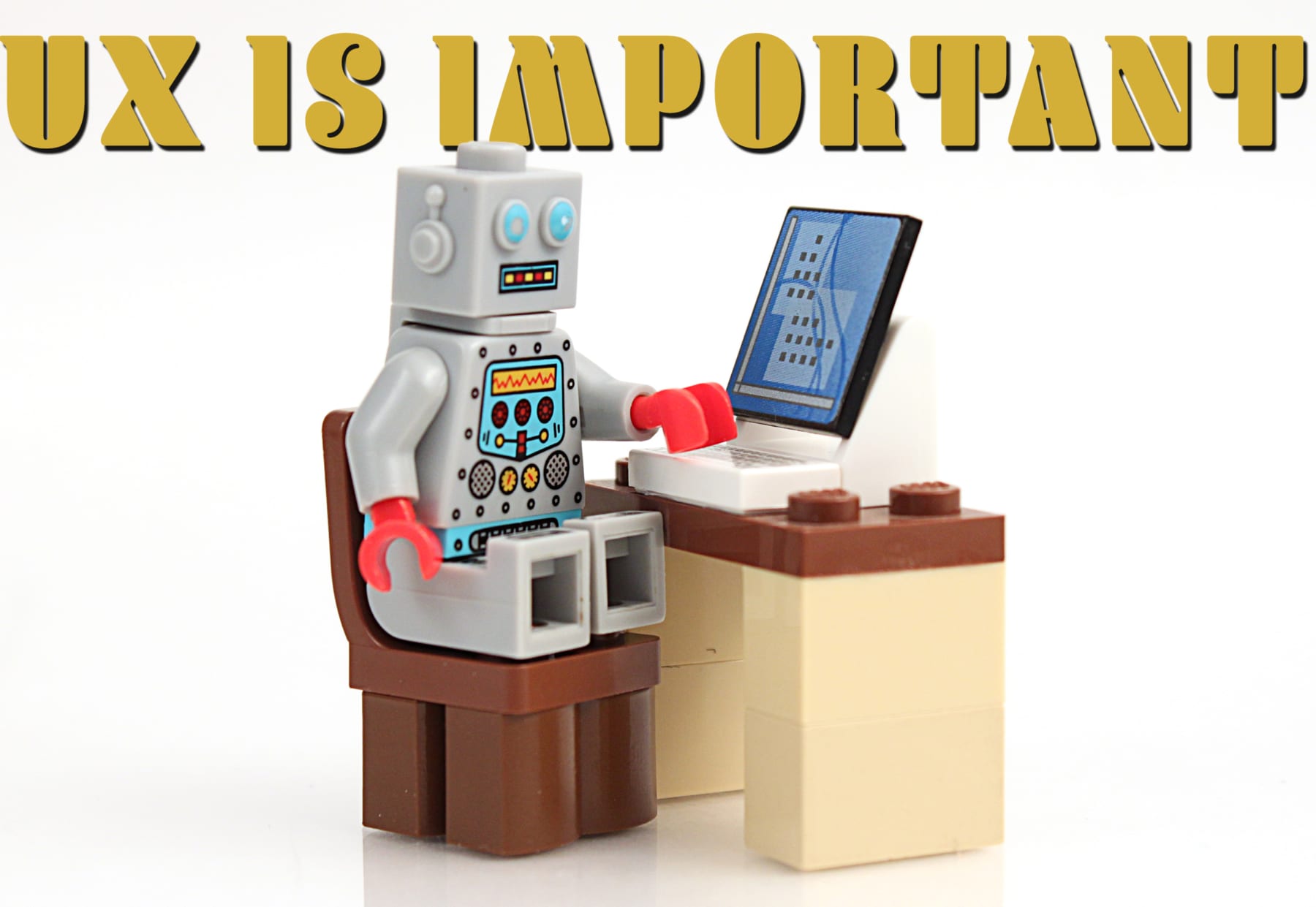
The user experience is important. This holds true be it with guests in a park, someone buying a new phone, or when you’re trying to change the navigation destination in your car. A good UX interface is remarkable for being, well, unremarkable. Everything works. The buttons are where you expect them to be. And the interaction of person and machine is an easy affair. Bad UX, however, is easily spotted and oft-discussed. Ford’s Sync has gotten better over time, thankfully. Audi’s MMI technology has shot to a class-leading position of enviable UX design. Lexus… is still figuring it out.
What happens though, when UX is scaled down to a smaller scale? Let’s say, 1/45. Actually, how about we call it Minifig scale, because that’s the size of the LEGO universe, and guess what? UX matters here as well.
LEGO Interface Panels
Oh this is wonderful https://t.co/z7JGgDlzJh
— Jason Torchinsky (@JasonTorchinsky) August 4, 2020
LEGO interface panels are beautiful, iconic, and great for learning interface design basics.
I bought 52 of them from BrickLink and had a lot of fun last week analysing the design of them all. Here's what I learned: https://t.co/MryEwjSq1f— George Cave (@George_Cave) August 3, 2020
A tweet by Friend of Hoonivderse Jason Torchinsky led me to a wonderful article written by George Cave. George is a design engineer based in Austria. Clearly he has a passion for not just how things work, but also how you work with those things. Even when the “you” is a LEGO person, and the “thing” is a LEGO Interface Panel.
How to organize it all
We’re dealing with lots of buttons. There are switches, dials, readouts, knobs, levers, and more. All designed to fit on a 2×2 brick which in turn could prove useful for piloting a cargo ship, delivering information for a crucial interplanetary mission, or keeping a race car running strongly. But how do you disseminate all of this data? By organizing the chaos, as Cave puts it.
Some of the panels are All Screen and some are No Screen. Some are Organized and others are Chaotic. And every panel that George has can fall somewhere along the quadrant map he’s created.
History teaches us why UX matters
Before further diving into which panels work better than others, Cave delivers a quick history lesson in the importance of UX. It seems that B-17 bomber pilots had issues with the landing gear of their planes back in WWII. Around 400 of them raised the gear just before touchdown, resulting in serious pilot error and catastrophic consequences. Why did this happen? The controls were poorly laid out. When you design landing gear controls, make them the same shape as flap controls, and then put those controls next to each other, you’re bound to have some horrible things happen.
Fixing that issue gave rise to the notion of shape coding and differentiation of systems.

There’s far more to discover, of course. As this leads to a discussion of how size, shape, color, texture, position, and operation all affect UX layouts. And it all makes for a wonderful story… which at its heart, is about the different designs of LEGO interface panels.
If Atomic Toasters was still buzzing, this article feels like a perfect fit.


Leave a Reply