
When a car first finds itself being dreamily outlined on a piece of designer’s layout paper, it will inevitably begin life as a series of swoopy lines. The general aesthetic concept will go through a whole series of disposable sketch stages before one of them is thumb-upped for further evolution. A long way down the line some engineering-type folk will set about converting that flight of fancy into something which can actually be produced.
Sometimes it’s easy see where the final build has had to be “fudged” a bit to comply with the stylists imaginings. A prime example can be found in the front and rear light units on a car, which are often contrived to be a certain shape whether there’s any legitimate justification for it or not.
Being able to see where this has happened has become my new design pet hate.

Look at the above tail-lamp cluster from a recent Ford Fiesta. The entire top half of this unit doesn’t need to be there. It’s just a plastichrome moulding behind a red tinted lens. But, of course, the stylist always intended that the cluster should be this shape. Did he imagine that the whole thing should light up? We may never be told.
There will have been an individual, or a team, put in charge of the rear lamps. Maybe they intended that the whole thing should illuminate, maybe it was overruled by cost, production or legislation issues. Whatever the reasoning for the big, useless expanse of light that isn’t, it’s self-evident that the manufacturer knows that the whole assembly isn’t as good as it could be.
“In an ideal world it would light up, but it can’t, so it won’t. Sorry about that”
Then change it! If it doesn’t need to be there, if it serves no purpose, get rid of it. Yes, the Fiesta is a lovely looking car, yes, those rear lamps are vital to its aesthetic. I just wish they were a bit more, well, honest.
Do you have an equally unreasonable and unjustifiable auto-design based rant this week?
(Images of bits of a Fiesta copyright Chris Haining / Hooniverse 2015. Unreasonable viewpoints belong entirely to Chris Haining and by no means reflect the general opinion of Hooniverse, who continue to tolerate my outbursts).
Seeing Red: A Tail-Lamp Design Rant
About
-
They were butt turrible at, you know, being lights, but I miss the honest styling application of sealed-beam headlights. Sometimes designs come out better when there are restrictions.
-
For sure! That’s what brought us POP-UP HEADLIGHTS!
-
-
How about fake exhaust pipes. This example is a little extreme as it comes from the Chinese Senova D70 but the red arrow points to the actual exhaust pipe
-
Hey, at least those fake outlets will never turn black.
-
-
This is nothing new. My 1990 Civic taillights extended all the way across the rear, but only the outer portions actually illuminated. I can think of other past examples of taillight cheating.
-
There are loads. Also see the Ford Scorpio which looked like the lights spread all the way across the back but only a small portion lit up. And also those Mercury Sables whose front lamp infill panel didn’t light.
It’s only recently started to bother me.-
The Sable’s front panel has lighted.
-
or “is lighted” or “has lights”
-
“has lighted:” It once lit up, but no longer does.
No one replaces all those bulbs. See: Buick Reatta.
http://www.buickreattaparts.com/image/101622739.jpg
-
-
I don’t think they all did, though….. Pretty sure some had the panel just for decor.
-
IIRC, the Sable lit up. At least from the factory. The bulbs were expensive and obviously not vital to vehicle operation so…
The later editions of the Topaz looked similar but did not light up. -
They all lit up, but the four tiny halogen bulbs in that panel were more expensive each than the headlight bulbs that actually did something. So a lot of owners never bothered to replace them as they burned out.
-
-
It was called a “laser light bar”. Clever, huh?
-
-
-
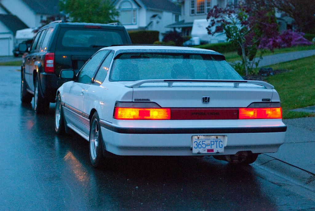
For whatever reason I don’t mind the full width “taillights” on older Hondas. It could be my extreme bias or it could be the fact that it’s a handsome design whenever the lights are off.
When on… it could be better.
http://i194.photobucket.com/albums/z313/ndrwhrnr/DSC_5420_zpsfkiqla3m.jpg -
My 96 Saturn coupe has the same huge rear light bar with just the sides lighting up.
-
-
You know what really gets me going?
WHY ISN’T THAT DIVIDER LINE STRAIGHT?????-
Great. Now I’ll never unsee that.
-
Designer in a hurry sneezed?
-
It’s like the horizontal bit melted a little and sagged down over the vertical bit. HATE it.
-
-
The tail lights on that generation Accord are a mess. The top of the lamp is canted but the trunk fill panel is straight. The height of the fill panel relates to nothing in the lamp. The fill panel has a chrome strip that lines up with nothing in the no-chrome lamp. The quarter circle reflector section almost lines up with the chrome, but doesn’t. The clear section has that little pimple for no real reason. And in the middle of all that they make the illuminated section round because, why not?
It hurts me to look at it.-
Acura was equally guilty with their designs at the time too. A great way to make a car look bloated is to festoon it with useless plasti-chrome and then put on tiny little taillights.
http://images.thecarconnection.com/lrg/2013-acura-tl-4-door-sedan-auto-2wd-advance-rear-exterior-view_100403988_l.jpg
I could never figure out how those lights were designed by the same company that made these:
http://media.ed.edmunds-media.com/acura/tsx/2008/oem/2008_acura_tsx_sedan_base_rq_oem_1_500.jpg
So clean.-
(Fair warning – I have a degree in Industrial Design. Design speak ahead. :-P)
Those TL lights are miles above the Accord in my view. There’s a consistency in that the top, bottom and mid break are all at a similar angle and that angle works with the trunk cutout, the metal trim and the crease in the bumper. Even the “fangs” on the end of the add on spoiler are trimmed in a harmonious angle and the bottom of the badging too.
Additionally, the angle of the trunk cut flows visually up to the backlight with a nice parallel crease that aligns with the spoiler “fang”, sweeping into the trunk lip.
All in all, it may be busy but it’s cohesive to me. All those lines are working together, where the Accords’s lines seem to fight each other.
The TSX is equally cohesively designed, but simpler and cleaner.-
I’m not saying the lights were the issue with the TL. those lights are fine, the problem with that TL design to me is the middle looks heavy due to the angles all landing there. Like an overweight dog dragging its belly as it walks.
After the super-clean design (one of the best Japanese sedan designs) of the previous generation this was a major letdown for me.
-
-
Two things that irk me: The just barely wide enough lights to make requirements, that simply look lost in all of that huge rear end; and also the “crystal” clear lenses, a look that needs to be shelved, IMO. 🙂
-
-
-
-
Aren’t the parts that don’t light up usually there to meet some legal requirement for reflectors?
-
Only if there’s a reflector there. Nothing here.
-
Does anyone know why the reflectors never seem to be in front of the bulbs anymore? They used to often be, and it made sense to me. With the brake lights on, when they weren’t really needed, they basically disappeared. Now, they’re all mounted somewhere on the bumper. Is it a regulatory requirement, or just design element to fill all that empty space on the giant modern bumper covers?
-
-
-
Dis-honest design is a huge sub-category of bad design. And what is the dis-honesty?Something looking like what it isn’t.
My pet peeve is the extending upwards of the C pillar glass on the current Land Rover LR3,4/Discovery.It is obviously there to reference the roof edge light glazing of the earlier Discovery models. But it’s just opaque glass covering steel. Extra weight of glass with no added light to the interior.
Dishonest and bad design on a vehicle, which, ironically, is perceived by many as a design icon.
(Maybe that’s why,IMHO, it stands out.
http://upload.wikimedia.org/wikipedia/commons/d/d0/Land_Rover_Discovery_III_TDV6_20090611_rear.JPG-
The Nissan Cube pulls a similar stunt with its wraparound rear glass. Think it offers a panoramic view of what’s behind you? Nah, all that glass hides conventional thick C and D-pillars.
-
-
This brings to mind one of my bugaboos, not automotive. Ornate switch and outlet covers, usually cast and often gilded, that scream out “Light Switch!”, “Outlet!”.
-
Still better then when people wallpaper over them.
YOU’RE FOOLING NO ONE! -
In my last apartment, the light switch cover in the bedroom had what looked to be the Virgin Mary with her arms on the shoulders of a young boy and girl.
-
The one true light … switch.
-
Virgin…no virgin…virgin…no virgin. Who came up with that idea?
-
Creepy on multiple levels.
-
-
-
A little reminder how maximum functionality can end up looking like:
http://bringatrailer.com/wp-content/uploads/2015/05/1968-OSI-3.jpg-
From complete obscurity to internet car site ubiquity in one month, the Osi, with Ford van engine.
-
To be fair, OSI’s have been posted on BaT for a long time. Not that I knew them before that though…
-
-
Those look remarkably like the tail lights of an Opel Manta A, if I’m not mistaken?
A bit surprising as Osi was Ford-based, if I remember correctly?
-
-
Aston Martin- Nobody does it better!
-
The upper blackout line on the CX-3’s D-pillar. Waaah? It’s not like it lines up anything with anything, it’s just…THERE, looking disjointed and arbitrary.
http://i2.wp.com/paultan.org/image/2014/11/2015-Mazda-CX-3-012-e1416373385193.jpg -
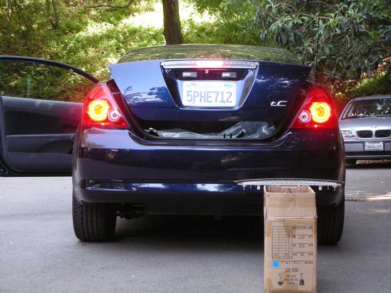
http://www.philsuslow.com/phil/tc-brake/DSCN0922-01-01.jpg
I always hated how on my tC the third brake light had a plastic lens that wen fully across the indent for the license plate, but only lit up the middle 40%.
One of the more popular swaps in the owners groups.-
Now that’s just inexcusable.
-
My pet peeve is sloppy design of the inside of the tail light. Where it comes out in a shape that doesn’t resemble the lens. My first gen Integra had crisp clear lines that looked engineered when lit, not slapped together
-
-
I’m not generally offended by this as a whole, and your Fiesta example doesn’t bother me. There are some that make me cringe. Older Impalas:
http://www.impalaforums.com/attachments/chevy-impala-7th-gen-discussion/9232d1359743481-03-impala-tail-light-question-dscn2126.jpg
On an unrelated note, did the two designers of the taillights on the old Sebring never talk to each other?
http://cck-dl.s3.amazonaws.com/2007%20Chrysler%20Sebring%20Limited%202.4L%204%20Cyl./Lights%20TL%20-%20Part%201.png -
There are good implementations of this, but they are few and far between.
Now…if there are lights in the housing, I’m good with it.
What bothers me more…much more…is the ‘styling’ crap which are ‘swoopy’ headlamps and tail lamps. The headlight housing DOES NOT NEED TO SWEEP BACK TO THE MIDLINE OF THE FRONT WHEEL ARCH!!!!!!!
PLZ STAHP!!!!!
OTOH, stuff like this is neat, and should return…if it’s done properly. Put sequential amber turn signals between the top and bottom rows, and that’s 100% WIN!
http://scontent-a.cdninstagram.com/hphotos-xpf1/t51.2885-15/10471838_656671607783776_117635809_a.jpg
Leave a Reply